
|
|
[2 of 5] |
| ||||||
|
Directory Opus 9 adds Tiles Mode which combines thumbnails (or large icons) and textual information in an easy-to-read layout.
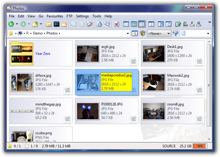 |
| One potential Tiles Mode configuration. |
|---|
You can change how Tiles Mode looks through Preferences.
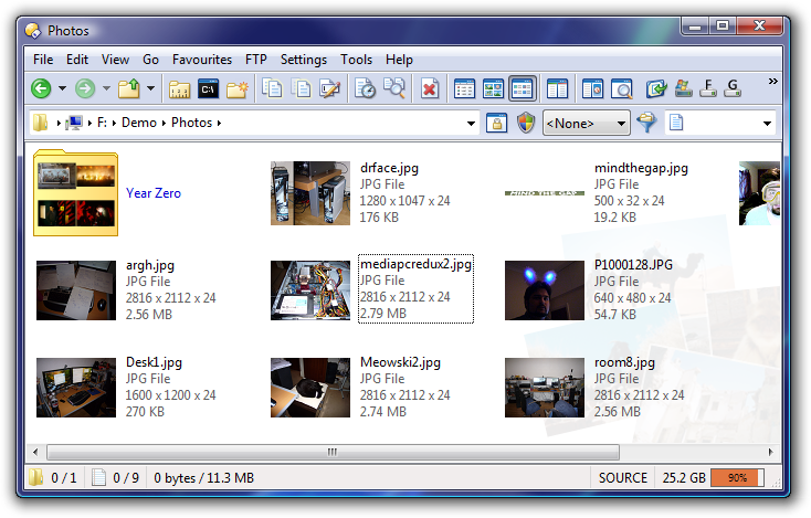 |
| Tiles Mode, vertical layout, sans borders. |
|---|
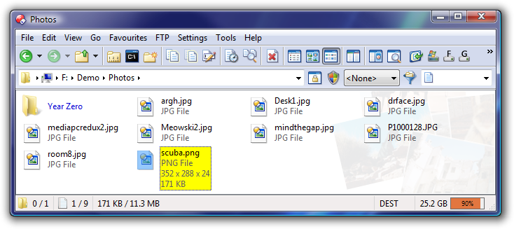 |
| Tiles Mode with less information shown and icons instead of thumbnails. |
|---|
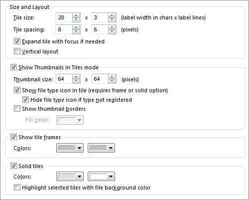 |
| Tiles Mode Preferences. |
|---|
Different file types, or file type groups, can be configured to show show different information in their tiles. This is configured in the same way as what's displayed in InfoTips and, as with InfoTips, you can include anything that is available as a column in Details and Power modes.
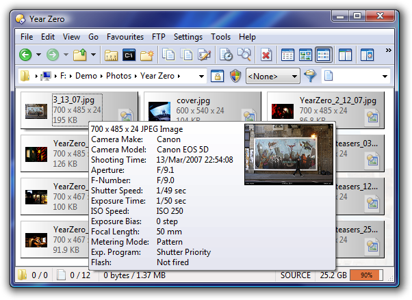 |
| Tiles Mode and InfoTips both display configurable information. |
|---|
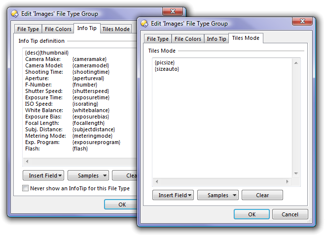 |
| Different information can be shown for different file types and file type groups. |
|---|
Thumbnails are drawn faster and you can specify how many threads are used to generate them (especially good for multi-cpu machines).
The thumbnail cache can be set to use lossless compression for higher quality.
Thumbnail borders look better and can also be turned off entirely.
Thumbnail scrolling with the mousewheel is smoother and reacts more quickly.
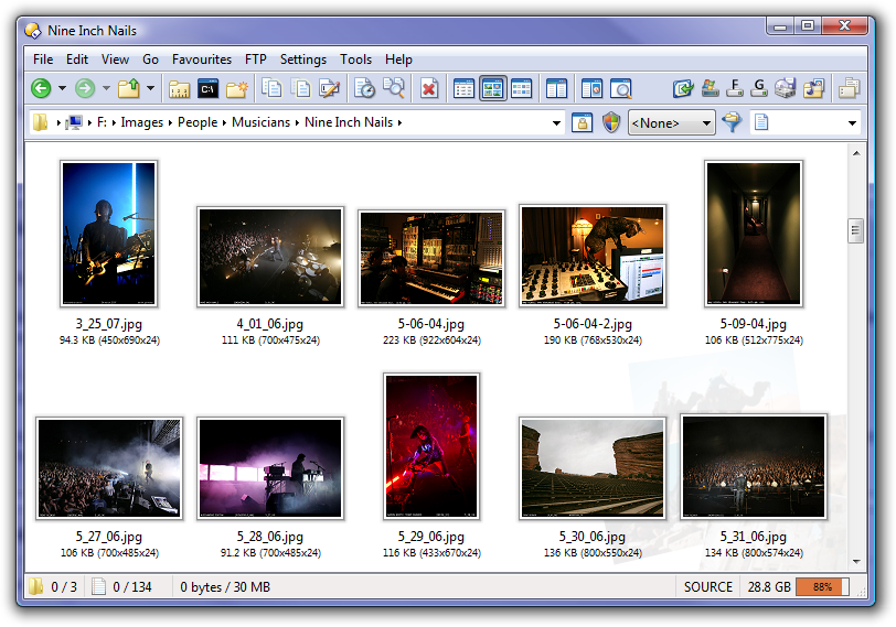 |
| Thumbnail borders look better now and have the same shape as each image. |
|---|
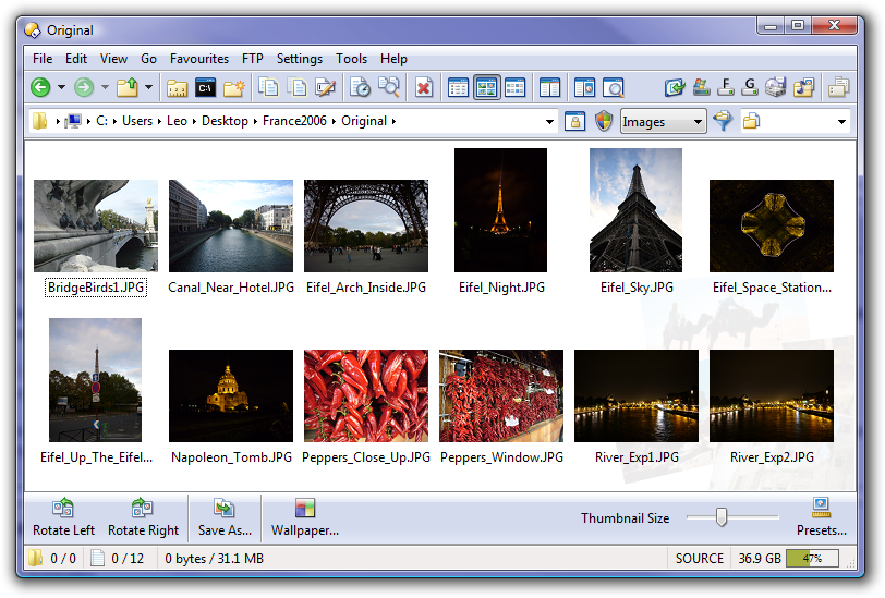 |
| Thumbnail borders can be turned off completely. Here the size information is also turned off. |
|---|
Grid Lines can be turned on in Details and Power modes. You can set their color and choose from several line styles (solid, dotted, dashed, etc.).
Partial rows are now displayed at the bottom of the window instead of leaving a blank space where a full row won't fit.
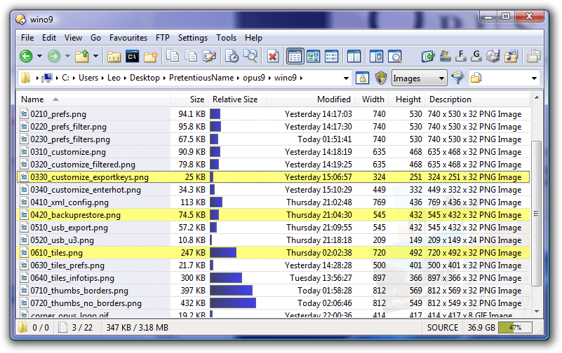 |
| Grid lines and full-row selection. Also note the partial row at the bottom. |
|---|
The underlying code for Thumbnails, Icons and List modes was re-written. While this was mainly for the benefit of the new Tiles mode it has also meant improvements for the other modes.
List and Thumbnail modes now work better with very wide filenames. In List mode is is possible to restrict the width of file names to avoid really wide columns.
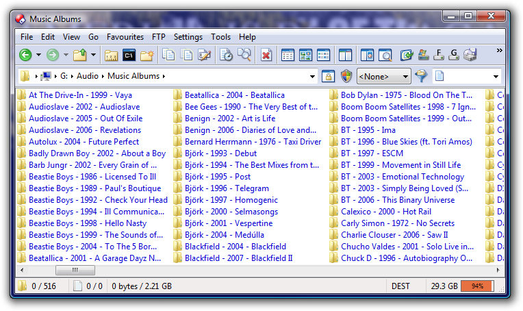 |
| Column width can now be limited in List mode. |
|---|
Several painting and scrolling problems in List mode have been fixed by replacing the Windows list control with the new custom code.
Clicking the spaces between thumbnails no longer selects the nearest item and double-clicking the empty space at the bottom of the list no longer launches the last file.
| Tip: | To restrict the width of names in List Mode, go to Tools -> Folder Options and ensure that Auto-size columns is turned off on the Display tab; then, on the Columns tab, set a new width for the filename column. |
|---|
| Tip: | Read the Folder Formats FAQ if you have trouble making your Folder Options stick to the directories you want them to. |
|---|
Opus 9 adds a "breadcrumbs" option to the various path field types that you can choose from.
The breadcrumbs field is similar to the path field in the Vista version of Explorer.
| Play video to see the Breadcrumbs Path Field in action. |
|---|
As with the "hot paths" file display border in Opus 8, the breadcrumbs bar lets you click on different parts of the path to go to them. You can also drag & drop items on parts of the path to move them there.
Clicking on the arrows that separate the items opens a menu showing the children of the item to the left, allowing you to quickly navigate to a related folder.
The menu for the very first arrow contains your favorites and special locations such as Desktop and Recycle Bin. The menu for the next level, "My Computer" or just "Computer" in Vista, contains a list of drives.
To save space you can have an icon instead of the the "My Computer"/"Computer" level, or you can turn it off completely.
You can also tweak the size of the arrows and the spacing between arrows and folder names.
The breadcrumbs field turns into a normal text box that you can type into and edit in the usual way if you click in the space to the right of the path, or click on the icon to the left of the path, or press the field's hotkey (normally F4).
| ||||||||
| Examples of breadcrumb appearance tweaks. |
|---|
By default the breadcrumbs field's menus do not display hidden and system folders but the showhidden and showsystem arguments can be used to change this.
If you start typing into the lister the Find Field appears automatically, similar to the Find field in Firefox.
You can search for files by typing the start of their names, the same as in Explorer and previous versions of Opus, but now you can see what you're typing, you get extra visual cues (the background turns red if there's no match) and you get the ability to backspace if you make a mistake.
The Find Field won't get in the way of your old keyboard habits. It hides itself automatically and it won't interfere with keypresses, like F2 and return, which still do what they used to.
You can also change directories by typing a path straight into the Find Field. Saves a few keypresses or mouse-clicks.
You can run any internal or external command via the Find Field by first typing a >.
|
<< This video requires JavaScript and Flash. >> |
| Play video to see the Find Field in action. |
|---|
The text viewer also features a similar field for easier searching within files.
Folders that you double-click outside of Opus (e.g. on the Desktop) can be sent to new tabs instead of new windows, if you like.
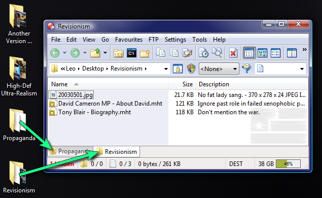 |
| By popular demand, you can now open double-clicked folders in new tabs instead of new windows. |
|---|
If you accidentally close a tab the new Undo Close Tab command means you can get it back again.
Folder Tabs can be "locked". There are two options, in addition to the normal unlocked state:
Changing directories in a locked tab opens a new tab and preserves the original.
Changing directories in a locked tab works as normal except that the original directory is restored the next time the tab is selected.
Folder Tabs can be renamed. (Useful when you've got tabs for two folders with the same name.)
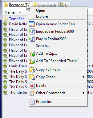
| Tip: | Folder Tabs have two different right-click menus:
|
|---|
Zip and RAR archives can now be expanded in the tree like real folders.
Optional automatic expansion and contraction of tree branches.
New options to change the look of the tree. Tree lines are optional and there's also a new look for Vista, if you want it.
More control over which items appear in the tree. For example, you can remove File Collections from the tree completely if you don't want it there.
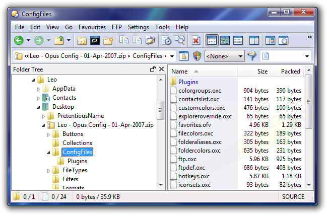 |
| Folder Tree viewing inside a Zip archive and set to the new Vista look. |
|---|
 |
| The new Folder Tree preferences. |
|---|
The Navigation Lock feature is not new in Opus 9 but it is somewhat hidden and was added to Opus 8 after my "Getting to Know..." tutorial was written, so it's worth mentioning in case you've overlooked it.
Navigation Lock is for dual-display listers which have similar directories in each side where you want to keep both file displays in sync when you change directories in either side. A common scenario is where you are comparing new and old versions of the same directory, for example a local copy of your website and the remote copy on an FTP server.
When Navigation Lock is turned on, going into a child directory on one side of the lister will do the same in the other side, if the child directory exists in both locations. If you parent up or go down another level then the two sides remain in sync.
| Play video to see Navigation Lock in action. |
|---|
| << Page 1 << | Page 2 of 5 | >> Page 3 >> |
